
How to Build SVG Line Charts with React, SSR and Tailwind CSS
In this post, I’ll explain how to create “your own” SVG line charts in React using server-side rendering. To use server-side rendering with React, you can use either Next.js or Gatsby.

Screenshots of Gatsby and Nextjs GitHub repository activity line charts
See the links below for a live preview and GitHub repository for the finished line charts using both frameworks.
I won’t cover how to get started with either framework, so please consult the documentation if you are unfamiliar with these technologies.
I also used Tailwind to style the charts. If you want to do the same, see the Tailwind docs for Gatsby and Next.js installation guides.
In the demo pages I used the GitHub REST API as data source, if you want to do the same you need a GitHub Personal Access Token; or if you prefer I have provided some sample data at the links below.
sample data
You can use any of the sample data gists below.
Gatsby Page Sample Data Gist
sample usage
Next.js page example data Gist
sample usage
What is server-side rendering?
Server-side rendering (SSR) is an application’s ability to convert HTML files on the server into a fully rendered HTML page for the client (the browser). Combining SSR with server-side data retrieval means you can generate the charts on the server from data that has also been “fetched” from the server.
Creating charts this way means that all data retrieval and rendering will work when either JavaScript is disabled in the browser or before React has hydrated the DOM.
Rendering charts this way means they never appear blank while data is “fetched” and you don’t see a “jump” or layout shift after the data is loaded; Using this method also ensures that your Lighthouse CLS results are not compromised.
Anatomy of a Line Chart
In the following sections, you create a number of different parts that make up a line chart. These are described in the diagram below.

Diagram showing different parts of an SVG line graph
Create a line chart component
Create a new component called
The component
Render the line chart on one page
Import that
Set up line chart
In this step, you define the variables that will be used to control the different parts of the line chart.
Here is a brief explanation for each of the variables.
- chartWidth: The width of the SVG ViewBox.
- chartHeight: The height of the SVG ViewBox.
- offsetY: Used to position the ticks.
- paddingX: The left and right padding around the line chart.
- paddingY: The top and bottom padding around the line chart.
- maxY: The maximum total value from the data array.
- guides: An empty array that determines the number of guides.
Line Chart Properties
The property array is created using a combination of values from the data prop and variables defined in the previous step. Each of the values returned is used in different parts of the line chart.
The two important values to consider here are x and y. These variables are created by combining a set of previously defined variables and the index value from the .map file.
The total and date values are returned unchanged.
Creating the X coordinate
The x-coordinate is used to create a location for the marker, value, and x-value for a polyline point.
The x-coordinate is created by taking the index value from the .map and dividing it by the length of the data being passed to the data support. Multiplying by the chartWidth and subtracting the paddingX value ensures that the x-coordinate value never exceeds the chart width limits.

Diagram showing the array .map iteration to create the x coordinate
Creating the Y coordinate
The y-coordinate is used to create a location for the marker, value, and y-value for a polyline point.
The y-coordinate is created by dividing the sum by the maxY value and multiplying by the chartHeight value minus the paddingY value. As an additional step, the paddingY and offsetY values are subtracted, giving extra space for the ticks at the bottom of the chart.
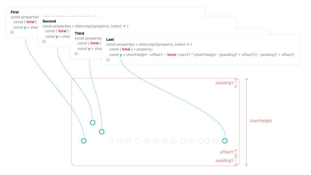
Diagram showing the array .map iteration to create the y coordinate
Creating the points array
The SVG Polyline element can be used to create a line connected by dots. To create the points for the polyline line, you can take the x and y values from the properties array and return them as an array of x, y positions.
The points array returns something similar to the following. Each index in the array contains both an x and a y coordinate.
Create SVG
Create a new one element, define the viewBox attributes and set the role to presentation.
Creating the polyline
Create a new one
Creating the markers and values
With the values returned from the properties array, you can now add and position svg elements to display the grand total(s) from the data array.
That
That
create ticks
The ticks are created a little differently, you’ll notice that that
This will create a new coordinate system so that when the rotation is applied to the text, its top/left position will differ from the top and left position of the
That
Creation of the guides
The guides are the last item to add; But instead of iterating over the properties array, this time iterate over the guides array.
This is just an empty array and the index is used to provide a key for React. The y-coordinate is created in a similar way as before, creating a ratio to ensure the y-positions stay within bounds and the ticks don’t overlap.
Using the values returned from the properties array, it is possible to add any number of different SVG elements to support displaying different values from different data types.
The x and y properties should be all you need. Although they’re a little tricky to create, they create the boundaries for any new elements you want to add to the chart.
Thanks for reading and if you have any questions please visit me on Twitter: @PaulieScanlon or visit my page paulie.dev where I have more React/Jamstack tutorials.
Further reading
